Supply and Demand Trading in 2026
We have been trading supply and demand strategies for over ten years, and they have stood the test of time remarkably well. Supply and demand is...

When I started out trading, all I knew about were time-based charts. It took me years to even hear or think about that there might be other types of charts to be used that are much more advantageous, especially to day traders, than time-based charts. This is because MetaTrader4, which most Forex traders use when they start out, does not offer any other charts. But looking at this screenshot from Sierra Chart shows that there are many, many more charts to analyze price.
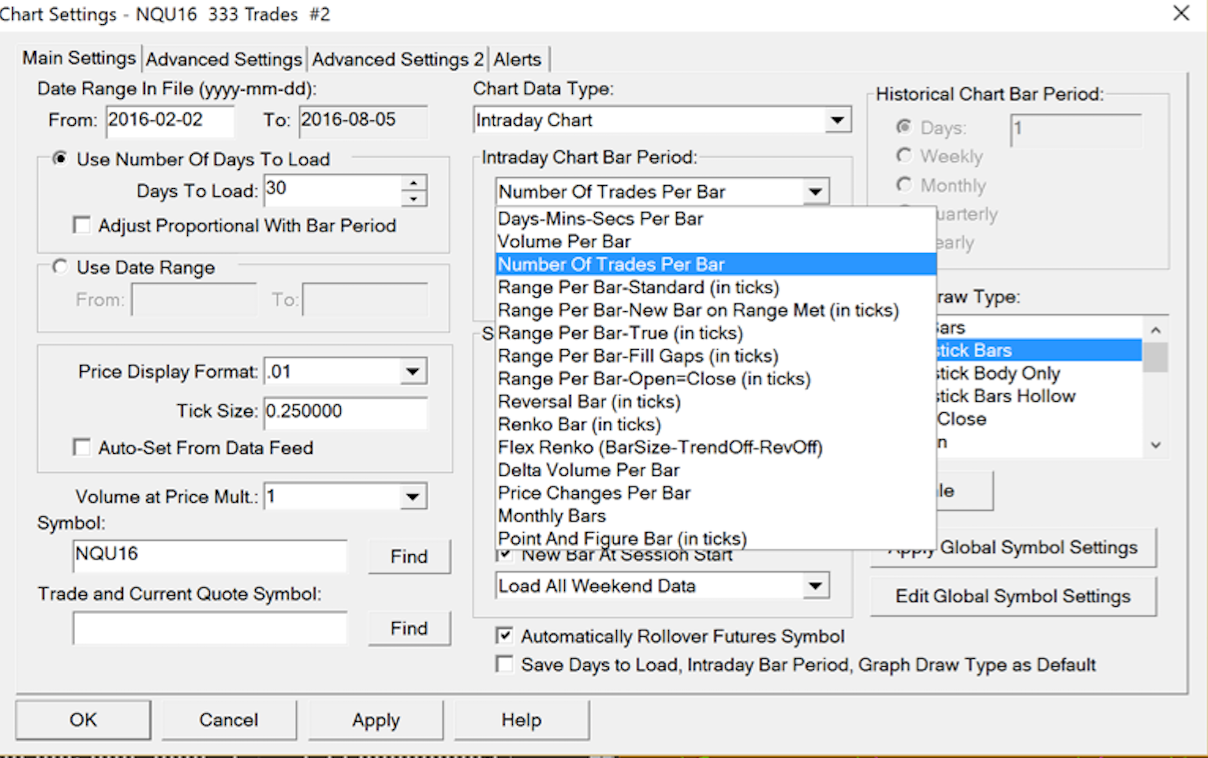
They all come with their very own advantages and disadvantages, of course, and are not the Holy Grail. We have to learn how to read them, as they are a tool as much as anything else. However, there are some charting types that appeal to me much more both visually and logically, than time-based charts.
At first, I switched to Renko Bars, which simply print a new bar when a certain number of ticks/pips up or down since the last bar close has been reached. They make S/R levels and price patterns much easier to see and place less emphasis on times of low volatility which is nice. However, whenever the market became volatile, they would print 100 or more bars in a few seconds, leaving me completely on the sidelines. There was no way to say when a new bar would print so I had to watch the charts rigorously, and would still get surprised when a new bar finally was printed. Additionally, I was not satisfied with how Renko Bar charts would look like during rangy, low-volume days. They would fake me out a lot, or not grant me any entries, and I had to switch the number of ticks represented by Renko bars to get tradeable charts, which eventually I did by resorting to ATR values, but this was just not what I wanted. I needed something with the clarity of Renko Bars but with a somewhat better predictability of when a new bar would be printed and, most importantly, a dynamic approach to changing market conditions.
Enter: Tick Charts (in Sierra Chart correctly called “Number Of Trades Per Bar”). These were a real eye-opener for me. They are not feasible in the Forex market, as there is no centralized exchange, and ticks don’t mean anything there. However, in Futures, there are centralized exchanges, and globally, every trade that comes into a certain market, is registered at the respective exchange with a certain volume and this information is accessible by everyone. And if you still want to trade Forex, simply go for the Currency futures on the CME which resemble what is happening on the Forex market but with complete volume data available and they are quite liquid now, plus tick charts work great, so go for it if you want to. So what tick charts do is that they count a certain number of trades which you have previously defined, and then print a new bar every time this number of trades is reached. For example, I use 333 ticks charts for timing my entries; that means whenever 333 trades came into the exchange, in whatever range price moved during that period, will then be shown as a candlestick bar. Time does not play a role here. In times of high trading activity, a new bar will be printed roughly every minute on the 333 ticks charts on the E-Mini Dow Jones, for example, and in off-times, it can take several hours for a new bar to be printed.
Mind you, tick charts are not to be confused with volume bars! Volume does not play a role for the creation of tick charts, as a trade is simply a trade, whether it comes with the size of 1 contract, or 500 contracts. Interestingly enough, as I observed, during certain times of the day every tick bar will close at around the same volume, but that is another story.
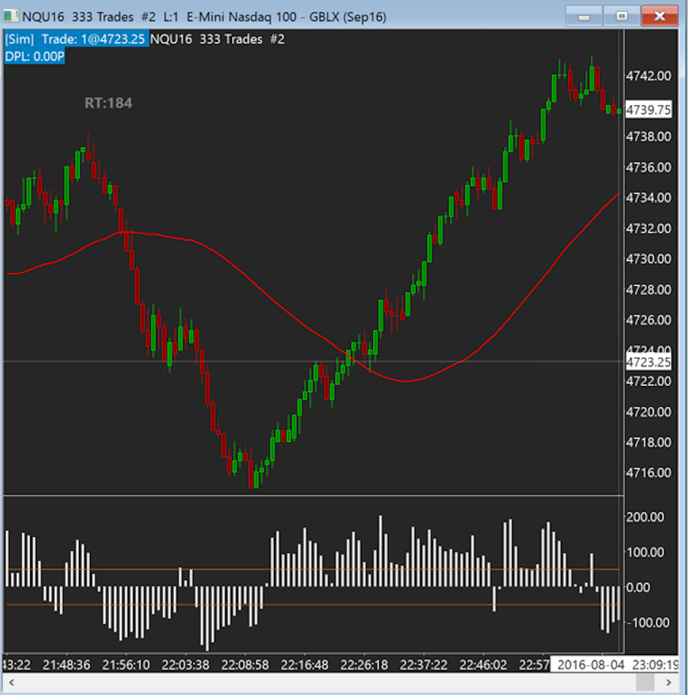
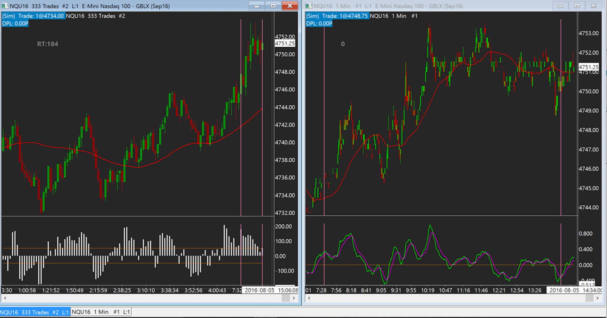
So other than different criteria for when a bar opens and closes, the charts look the same as time-based charts. here is a picture of a 333 ticks chart on the E-Mini Nasdaq.
Looks familiar, right? Now, the both in comparison. On the left, a 333 ticks chart, and on the right, a 5 minutes timeframe chart.
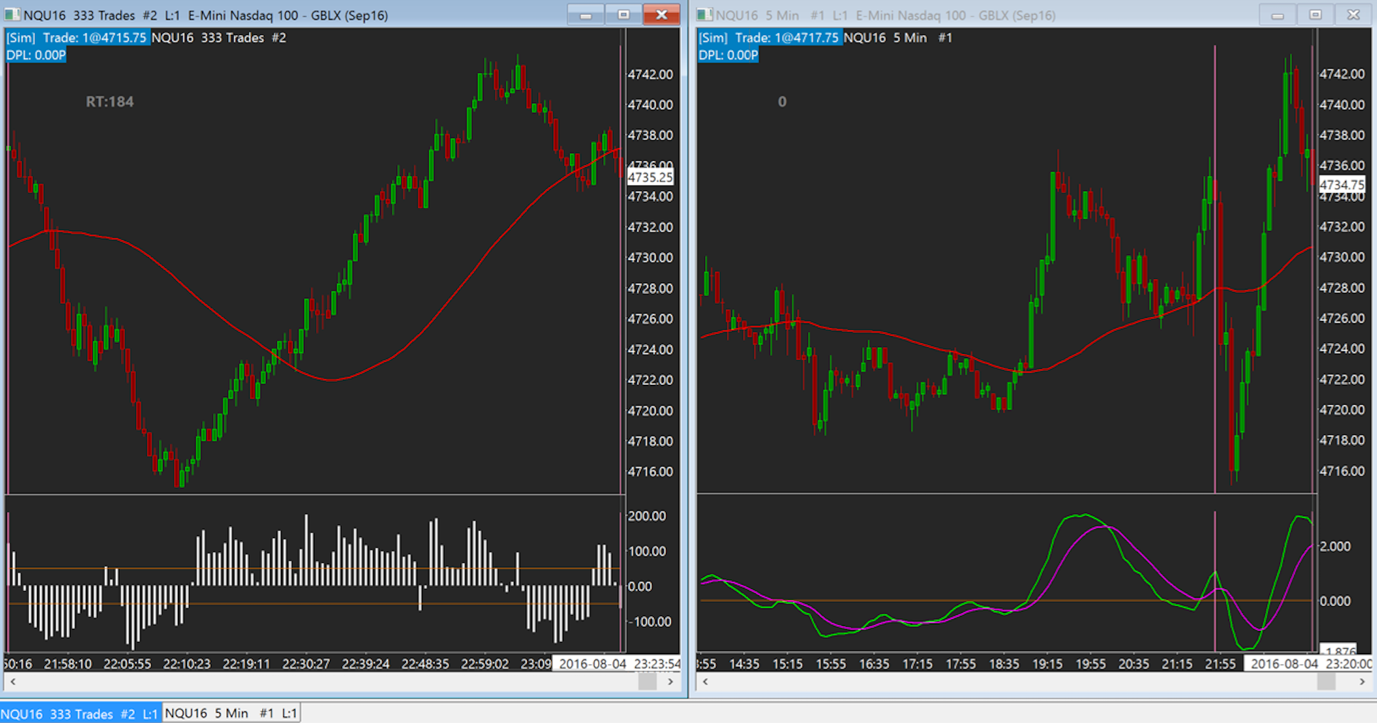
The two pink bars mark the same area on each chart. As you can see, while the tick chart printed a lot of bars during the volatile up-and down moves with plenty of entry opportunities, the 5m timeframe would have left you standing in the rain very likely, as V-tops and bottoms are almost untradeable on this very popular timeframe for daytraders. But how would it look on the M1 charts? Let’s see.
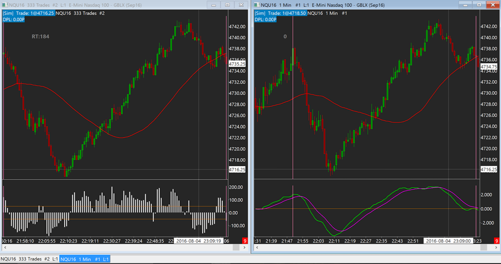
Now these charts look much more familiar, and the M1 becomes much more tradeable during these high volatility moves. So why not just trade an M1 chart? Well, because of this:
As you can see, the tick chart printed only 9 bars in roughly 7 hours during times of low volatility, delivering us an incredibly clean chart, while the M1 chart printed a lot of horrible stuff that would have lead us to trades where there are no trades. This can, of course, be partly solved by not trading during off-hours. However, this problem also exists during trading sessions with little trading activity, and these do happen again and again and again and are what actually cost traders a lot of money. Everyone can make money in a trending market, but how about when prices start to range, produce fakeout after fakeout, and behave not as we want them to? This is when tick charts are king, as they put much less emphasis on consolidations and times of low trading activity. They are, simply put, much easier to read and to trade. Basically, they are an “automatic” timeframe switch, a hack, so to speak. When things become hectic and we need to get in and out quick, tick charts resemble a M1 or even 30 seconds charts, and when things slow down and we have to back off, they resemble a M5, M15, M30 or even H1 chart much more, printing much fewer signals. They are doing a lot of the work for us, dynamically switching between timeframes, and not letting us trade shitty charts when we are not supposed to trade them.
Another thing that will almost never happen to you with tick charts is that you are left out, standing in the rain. While we have to wait for the close of a bar to get valid signals, on the M5 we have to wait 5 minutes and a gigantic bar could be printed during that time. On the tick charts, you will almost never see huge bars like that, as higher volatility means more bars, means more entry opportunities. Simple, isn’t it?
Also, if you want to use volumes, you can use a volume histogram, and if higher volumes are printed on average during the creation of tick bars, it means the professionals are trading, lower volumes mean the amateurs are trading, and thus you can follow the professionals much easier combining tick charts and volume histograms.
So, my two reasons for trading tick charts are:
These two facts will make trading much, much easier for you, trust me. I always had huge problems with multi timeframe analysis, whereas tick charts simply do the job for me by “switching” between timeframes when needed. And I still look at the 999 tick chart for more information on where price is going and when drawing S/R, etc.
This information can be applied to any market that grants users access to volume information, i.e. Stocks as well. As for the # of trades per bar, everyone got their own numbers here and you just have to see what makes the charts pretty and tradeable for your eye plus grants entry signals with moves big enough to outrun the costs of trading. Only trade pretty charts is my favorite quote. For longer term traders, I don’t think that tick charts are feasible, as we can never know when a bar closes (kind of, I have a count-down timer alerting me when a bar closes, but I still need to be at the laptop), and they are definitely more for the active daytrader.
If you want to know more about tick charts and how I trade them on the Futures market, check out my Youtube playlist:
https://www.youtube.com/watch?v=RbOV17DDZeg&list=PLxViDhXCHWLmot_ifyt5yuHgVGyseGRwP

external link:

We have been trading supply and demand strategies for over ten years, and they have stood the test of time remarkably well. Supply and demand is...
3 min read
Choosing the right trading journal is essential for traders wanting to analyze performance, refine strategies, and improve consistency. In this...
3 min read
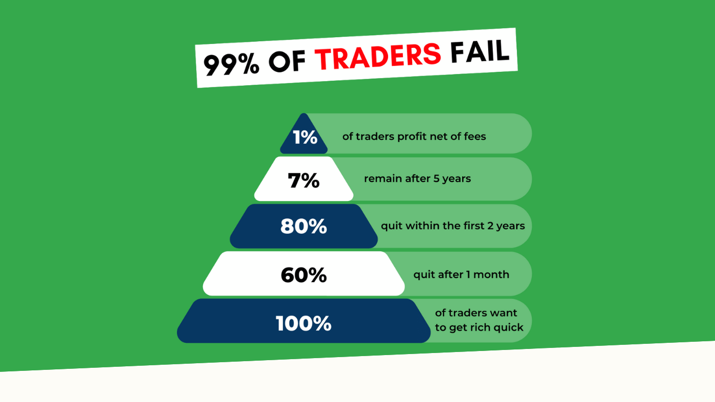
“95% of all traders fail” is the most commonly used trading related statistic around the internet. But no research paper exists that proves this...