Supply and Demand Trading in 2026
We have been trading supply and demand strategies for over ten years, and they have stood the test of time remarkably well. Supply and demand is...
Price action is among the most popular trading concepts. A trader who knows how to use price action the right way can often improve his performance and his way of looking at charts significantly. However, there are still a lot of misunderstandings and half-truths circulating that confuse traders and set them up for failure. In this article, we explore the 8 most important price action secrets and share the best price action trading tips.
Support and resistance indicate important price levels, because if the price is repeatedly forced to turn at the same level, this level must be significant and is used by many market players for their trading decisions.
If an upward trend is repeatedly forced to reverse at the same resistance, this means that the ratio between the buyers and the sellers suddenly tips over. Not only do all buyers withdraw at once, but the sellers immediately dominate the market activity when they start the new downward trend.
Naturally, support and resistance do not always stop the price from continuing a trend. Breakouts can provide high probability trading signals as well.
The conventional technical analysis says: The more often the price reaches a certain level of support or resistance, the stronger it becomes. However, I cannot fully agree with this.
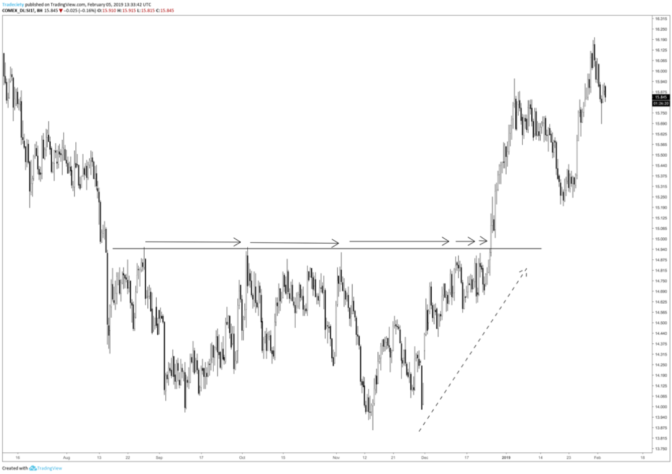
Every time the price reaches a support or resistance level, the balance between the buyers and the sellers changes. Whenever the price reaches resistance during an upward trend, more sellers will enter the market and enter their sell trades. If the price reaches the same resistance level again, fewer sellers will wait there. This phenomenon is also called order absorption. The resistance is gradually weakened until the buyers no longer encounter resistance and the price can break out upward and continue the upward trend.
We can observe this phenomenon when the rejections from a resistance become increasingly weaker and the price can return to the resistance level more quickly in each case. Formations such as triangles or the Cup and Handle are based on the concept of order absorption as well.
The figure below shows such an example. The Silver price returns sooner and sooner to the same resistance level, as the arrows indicate. This suggests that fewer sellers are interested in selling at the resistance level each time. In this case, the resistance level becomes increasingly weaker. Furthermore, just before the breakout occurred, the trend was accelerating upwards as the dotted arrow indicates. Eventually, the price broke through the resistance level and an extended upward trend emerged when no selling interest was left.
At any given time, the price can either rise, fall, or move sideways. This may sound simple, but as we have already seen during the candlestick analysis, we can quickly acquire comprehensive knowledge when we break down complex facts into its single components.
The screenshot shows that each chart comprises the following five phases:
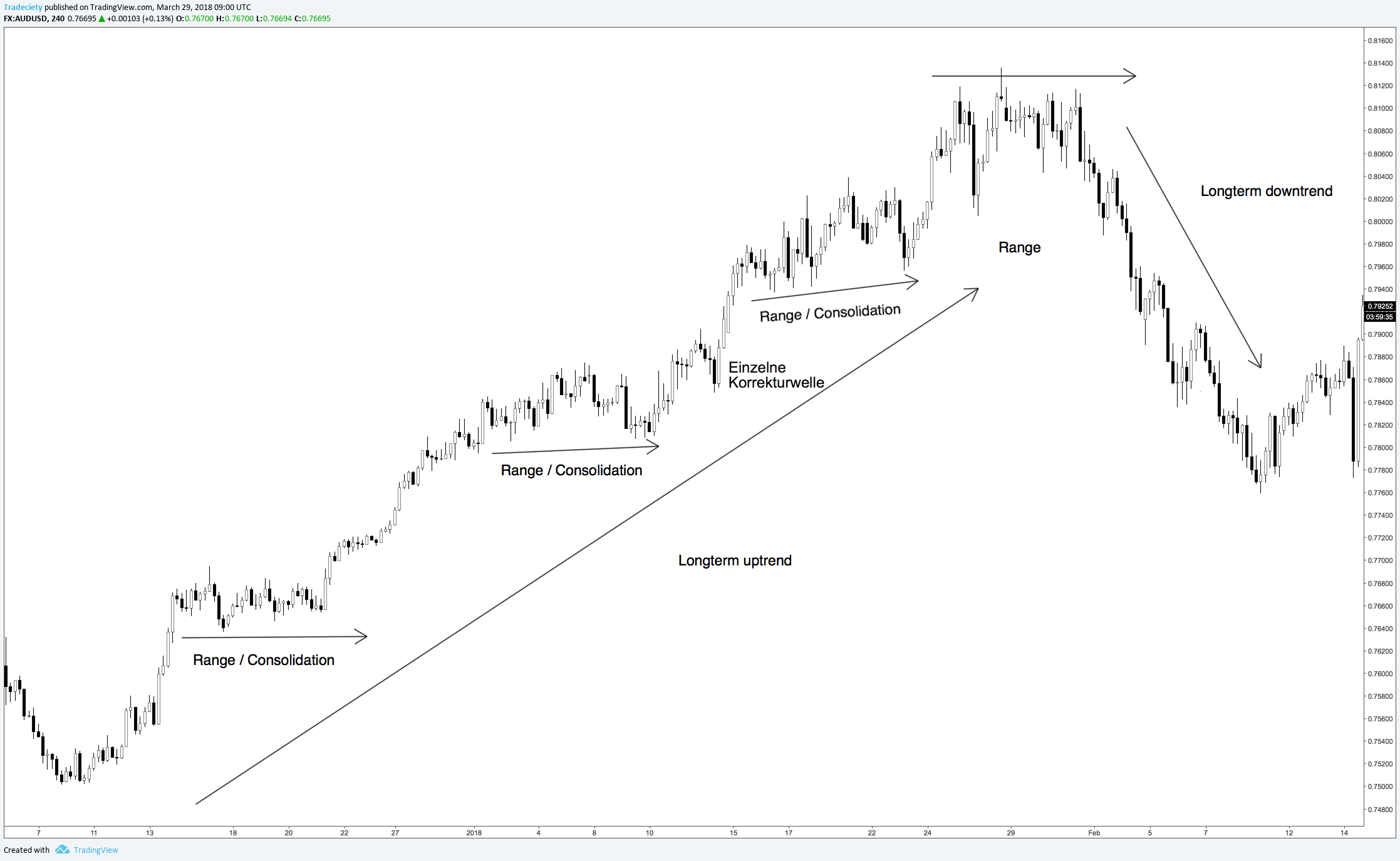
If the price rises over a period, it is called a rally, a bull market or just an upward trend. If the price falls continuously, it is called a bear market, a sell-off or a downward trend.
Different trends can have varied degrees of intensity. In the next section, we will learn the individual facets of trend analysis.
Corrections are short price movements against the prevailing trend direction. During an upward trend, corrections are short-term phases in which the price falls. As we will see, the price does not always move in a straight line in one direction during trend phases, but constantly moves up and down in so-called price waves.
Consolidations are sideways phases. During a sideways phase, the price moves sideways in a usually clearly defined price corridor and there are no impulses to start a trend.
The buyers and the sellers are in equilibrium during a sideways phase. If the strength ratio between the buyers and the sellers changes during consolidations and one side of the market players wins the majority, a breakout occurs from such a sideways phase. The price then starts a new trend. Breakouts are, therefore, a link between consolidations and new trends.
If a correction continues for a long time and if its intensity increases, a correction can also lead to a complete trend reversal and initiate a new trend. Like breakouts, trend reversal scenarios, thus, signal a transition in prices from one market phase to the next.
The chart phases can be universally observed since they represent the battle between the buyers and the sellers. This concept is timeless and it describes the mechanism that causes all price movements. The trend phase pushes the price upwards, indicating the buyer overhang. The consolidations mark temporary trend pauses; however, a trend is continued until the price does not reach a new high during an upward trend. Corrections show the short-term increase of the opposition. If these are fended off, the trend continues its movement. On the other hand, long correction phases eventually develop into new trends when the strength ratio shifts completely.

Although the sequence and strength of individual chart phases can vary greatly, any chart contains only these phases. If we understand them comprehensively, price analysis becomes relatively simple.
Now, we are going even more granular. After seeing that any chart can only be made up of the various chart phases, which are made up of price waves themselves, we will explore the four different elements of wave analysis. Those conclude our foundational work. Every following chart formation, and any chart in general, can then be explained and understood with the previously learned building blocks.
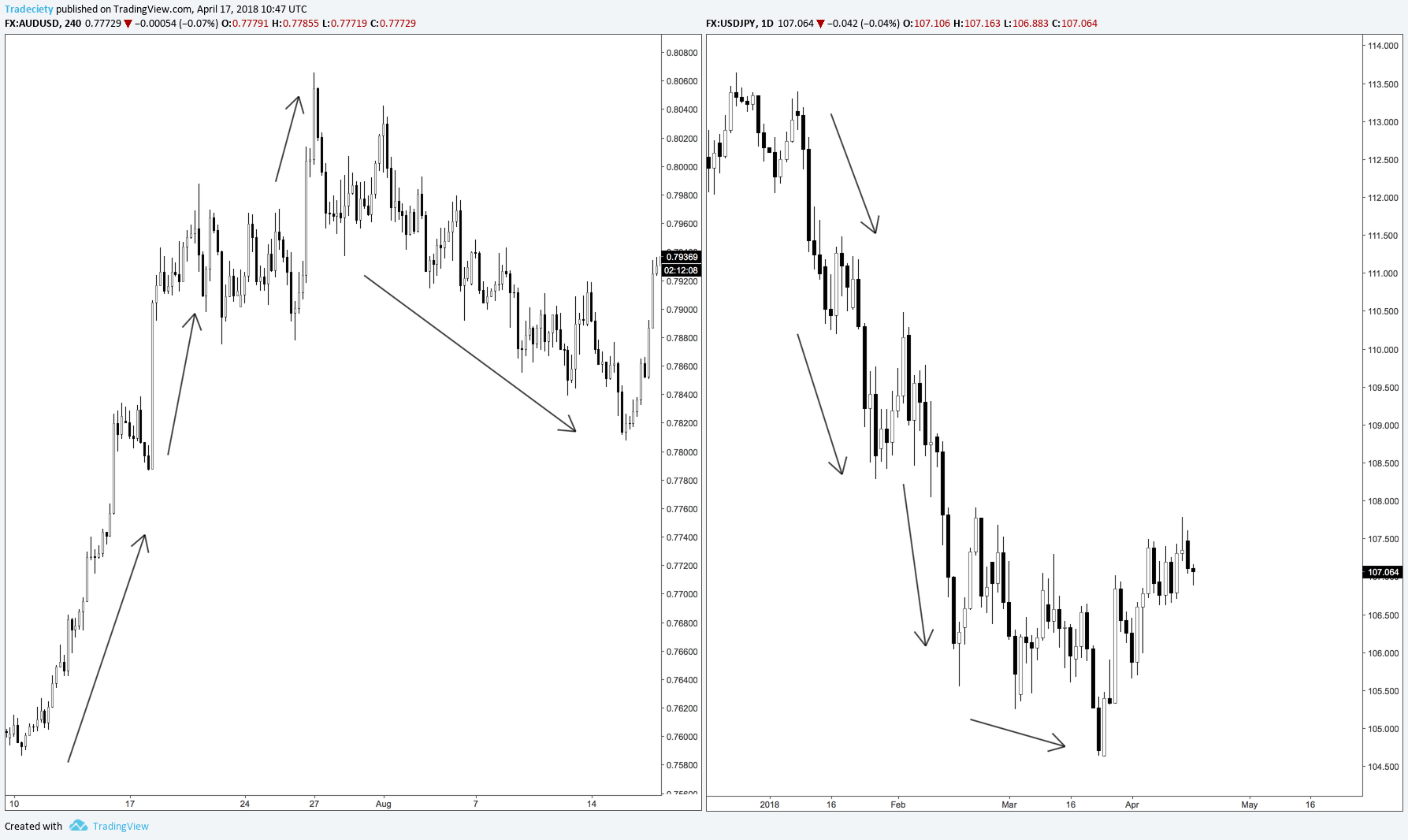
The length of the individual trend waves is the most important factor for assessing the strength of a price movement.
During an upward trend, long rising trend waves that are not interrupted by correction waves show that buyers have the majority. On the other hand, smaller trend waves or slowing trend waves show that a trend is not strong or is losing its strength. The figure below shows that the trending phases are clearly described by long price waves into the underlying trend direction.
Left: Long trend waves confirm the high trend strength. The trend comes to a standstill as soon as the waves shorten. Right: The downward trend is characterized by long falling trend waves. However, the length decreases downwards and the trend reverses shortly thereafter.
The rate with which the price rises during a trend is also of great importance. In general terms, moderate trends have a longer life span and a sudden increase in price usually indicates a less sustainable trend. We can often observe this phenomenon during so-called (price) bubbles, wherein the price falls again just as quickly after an explosive rise.
The development of the steepness of trends and price waves, compared to the overall chart context, is also important: Accelerating or weakening price waves might show that a trend is picking up speed or is slowly coming to a standstill.
Interesting correlations can be made together with the concept of length: A trend is intact if we find long trend waves or trend waves that become longer with a moderate or increasing angle. On the other hand, a trend with trend waves that become increasingly shorter, and which is simultaneously losing its steepness, indicates a possible imminent end. The screenshot below shows such a situation where the length and the steepness changed during the uptrend. The complete reversal soon followed.
More: Trend strength with indicators
– Ad: Tradeciety’sTrend Rider Indicator – 
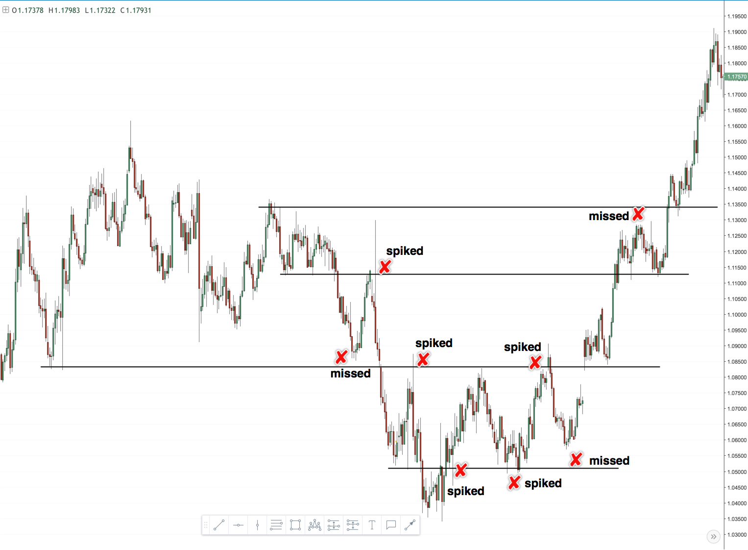
Even if you see the best price action signal, you can still greatly increase your odds by only taking trades at important and meaningful price levels. Most amateur traders make the mistake of taking price action signals regardless of where they occur and then wonder why their winrate is so low.
In my own trading, I pay a lot of attention to the location. A good signal at a very important support/resistance or supply/demand area can often foreshadow a great trade.
On the other hand, even a great price action signal at a bad location is nothing that I would trade.
To increase the chances of a successful trading opportunity, do not blindly enter trades in such support and resistance areas. It is advisable to wait for more confluence factors. For example, if a head-and-shoulders formation or a double top appear at a support and resistance level, then this can increase the chances of a positive result.
The screenshot below shows how the left head-and-shoulders pattern occurred right at a long-term resistance level on the right. Point 4 on the right chart marks where the head-and-shoulders forms. Zooming in and out on your chart can often help to see the bigger picture better and enable you pick up important clues.
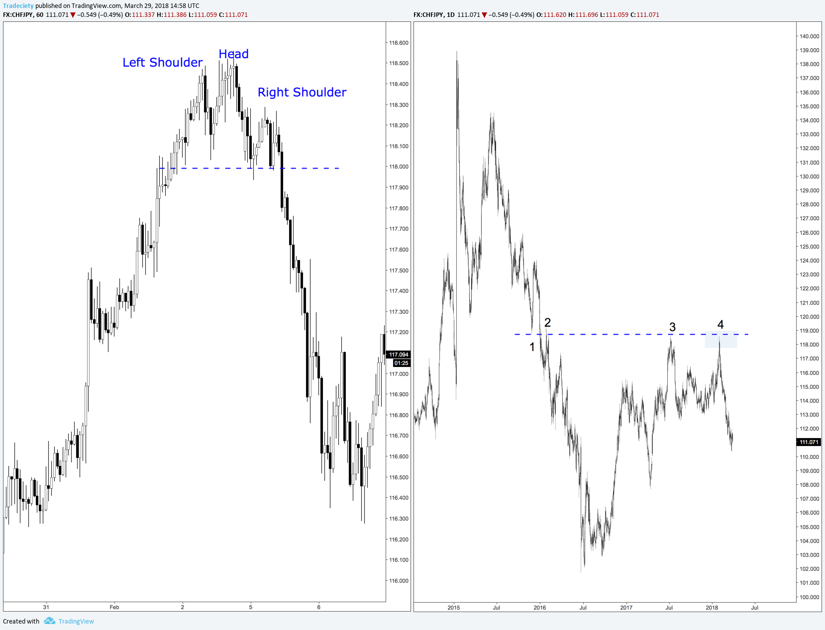
When we zoom out, we can see that the Head-and-shoulders formation forms directly at the lower end of the strong resistance level, creating additional confluence for our trade.
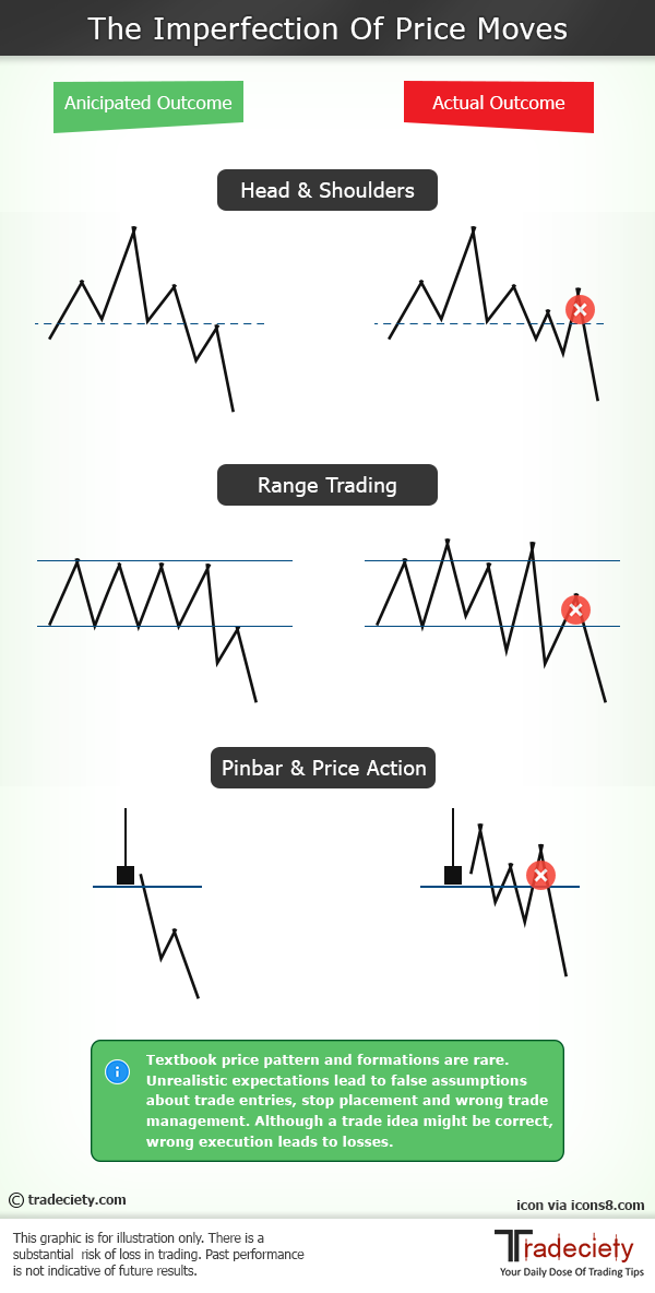
One big problem I often see is that traders keep looking for textbook patterns and they then apply their textbook knowledge to the charts.
Just ask yourself: why do so many traders lose money? Does it maybe have to do with the fact that they all read the same books, trade the same patterns in the same way and look at charts identically? I think so! As a trader, you need to think differently.
Trading doesn’t work this way and the price is a very dynamic concept. Price and patterns change all the time and if everyone is trying to trade the same way on the same patterns, the big players will use that to their advantage.
This is maybe one of the most misunderstood price action secrets. Stop looking for shortcuts and do not wait for textbook patterns – learn to think and trade like a pro.
To understand the price and candlestick analysis, it helps if you imagine the price movements in financial markets as a battle between the buyers and the sellers. Buyers speculate that prices will increase and drive the price up through their trades and/or their buying interest. Sellers bet on falling prices and push the price down with their selling interest.
If one side is stronger than the other, the financial markets will see the following trends emerging:
It is always important to keep this in mind because any price analysis aims at comparing the strength ratio of the two sides to evaluate which market players are stronger and in which direction the price is, therefore, more likely to move.
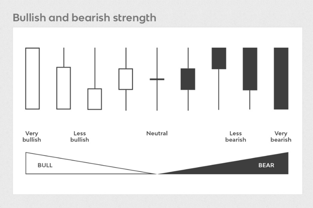
1) The length of wicks
If you see a lot of long wicks, it means that volatility and uncertainty are increasing.
2) Bullish vs. bearish wicks
Do you see more/longer wicks to the upside or to the downside? Wicks that stick out to the downside typically signal rejection and failed bearish attempts.
3) Position of the body
Is the body of a candle positioned closer to the top or the bottom of the candle? Bodies that close near the top often signal bullish pressure.
4) The body
Candles with a large body and small wicks usually indicate a lot of strength whereas candles with a small body and large wicks signal indecision.
Read more: How to read candlesticks like a professional
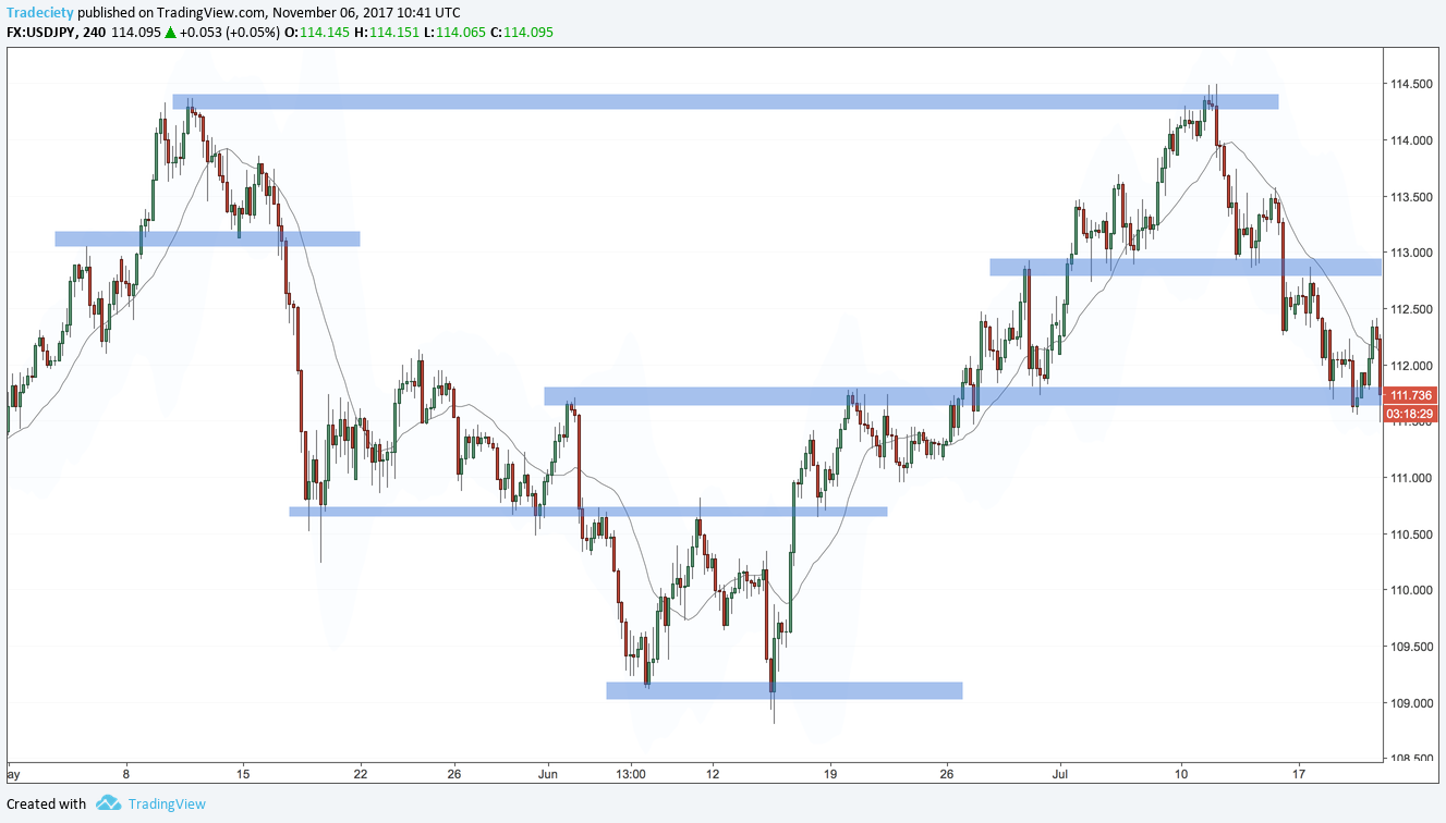
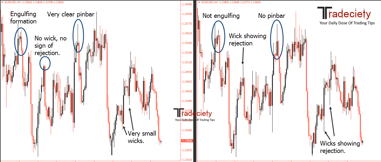
We get the question of how broker time and candle closing time influence price action a lot. It does not make any difference to your overall trading although time frames such as the 4H or daily will look different on different brokers.
The graphic below illustrates what we mean. The charts show the same market and the same period and both are 4H time frames. They used different closing times for their candles and, thus, the charts look slightly different. Some of the important clues that the left market shows are not visible on the right chart and vice versa.
So there is no broker time that is “better” than the other – just the signals you get slightly vary. The most important point is that you make consistent decisions and don’t confuse yourself by changing between different broker feeds.
Don’t stress out about your broker time; over the long-term, everything averages out as long as you stay consistent.
Conventional price action patterns are very obvious and many traders believe that their broker hunts their stops because they always seem to get stopped out – even though the setup was so clear.
It is very easy for the professional trader to estimate where the amateur traders enter trades and place stops when a price action pattern forms. The “stop hunting” you’ll see is not done by your broker, but by profitable traders who simply squeeze amateurs to generate more liquidity.
This is one of those price action secrets that can make a huge difference and we have seen that many of our students have turned their trading completely around with it.
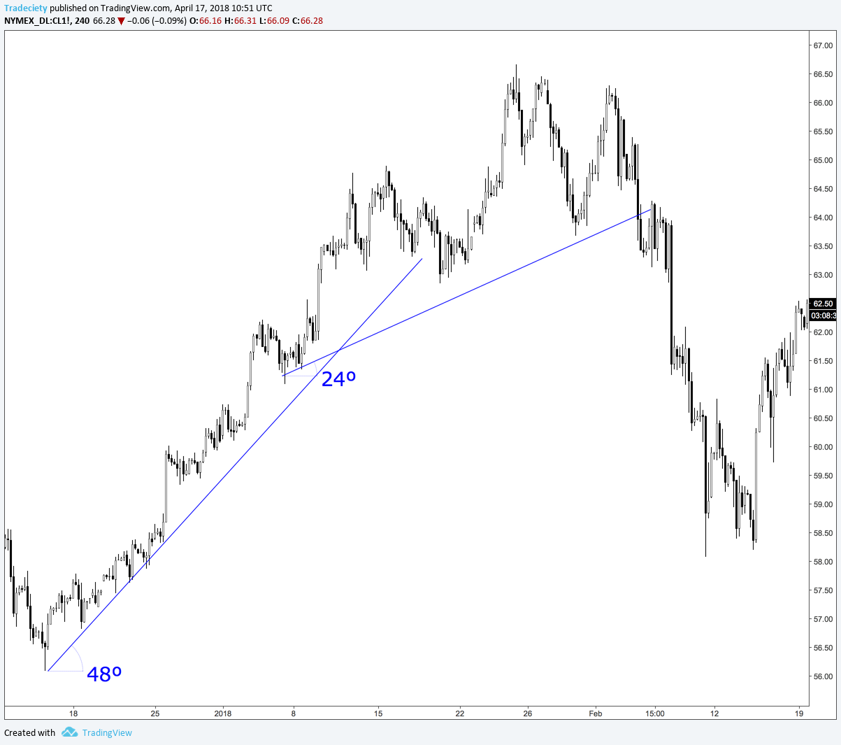
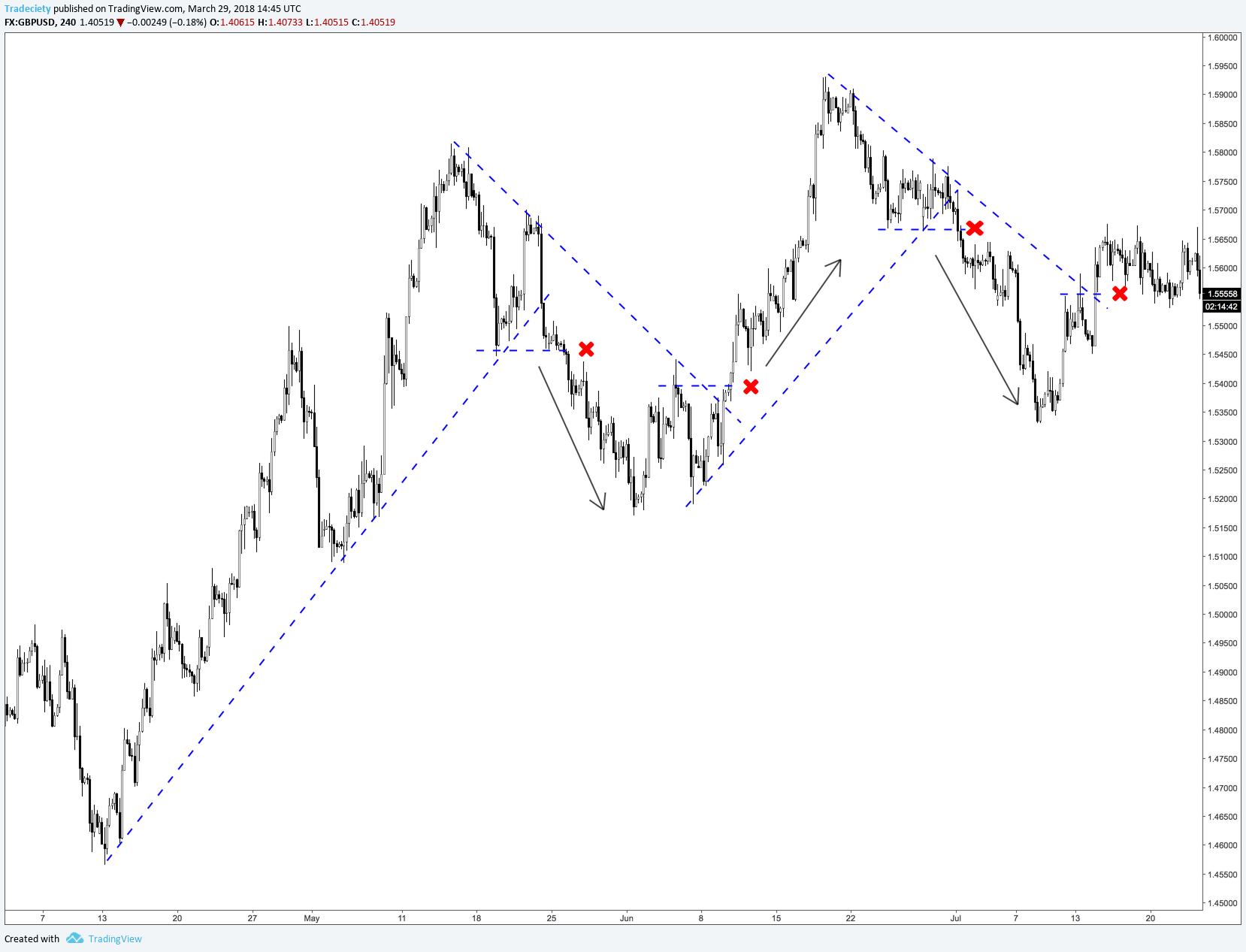
Traders can get into trouble quickly because it is not always obvious how a trend line can be drawn. If there are uncertainties in the correct application of the trend lines, it is advisable to combine them with horizontal breakouts. This makes trading more objective. Thus, do not trade at the first signal when the price breaks the trend line, but only when the price subsequently forms a new low or high as well. These signals usually occur in quick succession, and hence the trader does not have to wait too long for his/her signal, but can nevertheless improve the quality of his/her trading and, at the same time, integrate another confluence factor into his/her trading.
The next screenshot shows various confirmed trend lines with more than three contact points in each case. A break of a trend line always initiates a new trend. Interestingly, every break of a trend line is preceded by a change in the highs and lows first and a break of a more objective horizontal breakout. When the price breaks a trend line during an upward trend, we can often notice how the trend has already formed lower highs.
The break of the trend line is then the final signal, whereupon the trend reversal is initiated.

external link:

We have been trading supply and demand strategies for over ten years, and they have stood the test of time remarkably well. Supply and demand is...
3 min read
Choosing the right trading journal is essential for traders wanting to analyze performance, refine strategies, and improve consistency. In this...
3 min read
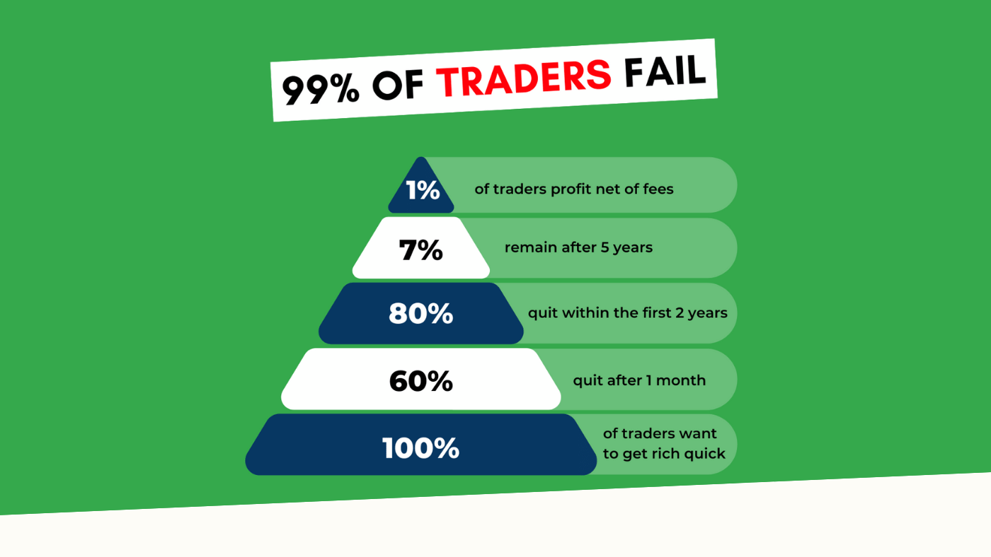
“95% of all traders fail” is the most commonly used trading related statistic around the internet. But no research paper exists that proves this...